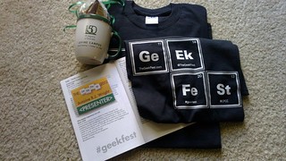
This is a guest post submitted by Craig Button (@TheProdSon)

Introduction, Quick Summary
Since most of you have no idea who I am, I suppose I should introduce myself. First and foremost I am a believer and follower of Jesus Christ. After that I’m a geek. I’ve owned just about every type of computer ever made and today work on both Mac and PCs depending on what I’m doing. I use both Pages and MS Word, prefer Excel to Numbers, and either PowerPoint or Keynote depending on what I’m doing. I’m a health care provider by profession, an educator by avocation, I’ve been clergy, (church offices on weekdays weren’t what I was expecting) and am now a grad student. I’m always looking for ways to package and present information.
I was excited when Apple announced iBook 2.0 and iBooks Author. I’m in the process of producing a couple of books/ebooks and was looking for something that would make it easier. I was hoping that iBA was going to be it.
After spending a few days playing with it (and I have to be honest and admit it was playing, not a focused systematic study/evaluation of the program) There are some conclusions that I’ve come to regarding iBooks Author which might not match your needs, but hopefully shines some light towards its strengths and weaknesses at this juncture of the application.
Summarizing the Positives and Negatives
There will be projects I’ll use iBA for. However, I won’t be using it for everyday kind of work. Not because, I don’t like it, or it’s a bad program, or even because of the EULA that says you can only sell product from iBA thought Apple. I’m accustomed to a bit more control and flexibility when creating publications, and iBA doesn’t quite meet those spot on – though its not far off.
Positives about iBA: It works, it looks good, it’s easy and it produces what it says it’s going to.
Negatives about iBA: it produces HUGE files. A test file went from 800K .txt file to 27MB (~1000K = 1MB) with a couple of pictures added. The second, and in my case the biggest thing against iBA, is it only produces a product that can be viewed on iOS devices. That means not on the Kindle, not on a Nook, not on an Android phone, not on anything unless it has been made by Apple. I’m a Mac fan boy. But, I’m about communication. Therefore, limiting my target audience isn’t good for me. My first product is to be a textbook on Critical Care for Emergency Room nurses. The second book will be first aid and health for photographers. Both topics I’m pretty passionate about (hence my issues with file sizes and limited devices).
It’s About Workflow
It’s about workflow. The term workflow is one that you hear in the digital photography world. It is the term that defines the flow of data from the camera to the final print. I think the term works well for the ePub/ebook industry as well.
My Workflow: I use a program called Scrivener. This is a Mac application, (Windows and Linux also available) that I use to produce the text of my work. It’s a combination text editor and research organizer. This is probably were 80+% of my work is done. I do all my writing within Scrivener. It also produces ePub files which can be read by nearly all computing platforms. It does have some drawbacks, with one of them being that its not easy to place tables and graphics into the output. From there, I use Adobe InDesign for layout that needs formatting and graphics. I don’t own this program; I rent it as needed since I only use it maybe 1-2 months out of the year. Using InDesign I produce a ePub, witch is a zip file that includes all the information needed for the ebook reader to read your file. It only takes a little modification for it to work on any of the readers.
How could iBA fit into this workflow? Well in my next publication, it might work for me. These books I’m publishing on health care and first aid directed at travel photographers whom are likely to have iOS devices. But, in using iBooks with plans on selling it, I’m sure the iPad market will be a bit too limiting. I will however give it a try. iBA is very easy, and I’m hoping it will allow me to easily produce the product I want. However, for anything that is text-based, or contains just a few graphics, the files produced by iBA are way to big and to limiting.
The workflow I have fits my use case, and allows me the broadest target audience. While I’m a geek, and still have a copy of the original PageMaker running on a Mac Classic, I’d like to have more control than what iBA offers. On the other hand, for someone who has never produced an ebook, iBA might be the perfect tool.
Conclusions
After writing the first few paragraphs, and sleeping on it, I came up with a few other thoughts. The first is that I’ve been through this kind of transition before. I remember when PageMaker first came out and people had lots of different fonts to use. I remember when Photoshop first came out and it was affordable to anyone to buy. People produced some horrendous publications and photos. And you’ve all probably sat through some pretty long, boring PowerPoint presentations. Just because the tools are there, doesn’t mean that everyone should use them.
I’m a Tim Taylor, not a Bob Villa, when it comes to using those hammers and screwdrivers. Like any task which needs to be done, it deserves to be done right. Use the right tool, have the right people use the tool, and spread the word.
For more information and to download (free), see the iBooks Author page on the Apple website. Note: content created with iBooks Author can only be read on devices with iBooks2 on the iOS device.
Craig is @TheProdSon on Twitter.
Continuing on Resolution #4: Raising the Bar on Mobile UX Standards
Sunday, January 22nd, 2012With that starting point, we want to highlight a bit more about Mobile (UX) Standards and in referencing that All Books Project, and some of the items to keep in mind whiile moving forward in your mobile initiatives this year and beyond.
Mobile UX Standards
It is assumed that the idea of what makes for a great mobile user experience is pretty easy – just grab yourself an Apple iPhone and use it for a week or two, then switch to another platform for the same amount of time and note how often you frown, toss the device, or find yourself limited in some fashion. And while we can agree that Apple’s iOS platform does make for some suitable claims towards what makes a good mobile experience (consistency, quality, variety of applications, etc.), its not the only mobile experience, nor does it answer every question anyone developing, selling, or using mobility will ask towards.
Over at UX Mag, an excellent article talking about mobile standards beyond the styleguides, frameworks, and guidelines that would usually reference as we develop apps makes an excellent point:
*List formattting added
Beyond simply saying “we want to go mobile” or “let’s use this or that to go mobile,” you really have to ask core questions about the interaction and steer adamantly towards those goals. What happens when you don’t steer specifically towards the goal, understanding these kinds of questions throughout, is that you end up with a glut of features, conflicting brand messages, dis-engaged users, and missed opportunities to deliever the depth of the Gospel that you/your group intends that application or service to portray.
Start With A Picture, Ask Until the Ink Dries
With the All Books Project, I started with an idea in my head (more efficient Bible reading on my personal mobile device that wasn’t limited to closed-licensed texts), and started scraping together what was needed and what wasn’t in order to make that happen. I boiled things down to two features: reading and searching. And then I took to one of my favorite apps on my iPad (Tactilis) to sketch some reasonable ideas towards how I would get there.
This UX flow document is my gage of whether I’m meeting my goals. If I am, then the lines here continue to make sense. If not, then I go back to this document towards what I (originally or later modified) thought and ask whether my thinking should continue down the path I’m or, or get back on course to what was drawn.
One of the pieces of interaction that I’m aiming for with All Books is a sliding popup for when I click on those verses with footnotes. The feature is harder to implement than its drawn. But, because I’m clear towards what I want to do when the popup is envoked, how its interacted with, and how it is dismissed, I can keep my programming focused and timelines (generally) well kept.
A Good Mobile UX Is Also Your Feedback Loop’s Process
In designing an effective mobile user experience (UX), you also need to take into account the development/design of your support infrastructure. As we talked about once before when developing mobile web apps, you need to have in place the resources not just to build the app, but to support, maintain, and maybe even update it.
Build, Get It Out There
After I was able to figure out my issue relating to displaying content within All Books, I needed to start using it. It didn’t matter that there was (noted) performance issues or the inability to see the footnotes as I’d like. Getting it into my normal use allows me to catch things that I’d not considered in my initial development and design, and then adjust on the fly without effecting other pieces of the project. For example, I realized that for all the work I did with makng this a spatially-orienting design, I still felt lost when navigating. The insertion of colored indicators on the section that I was within helped this considerably, and it was a few lines of code to add to do this (1 CSS class and 1 JS statement).
With that: do you have your mobile UX resolution refined now. Its the middle of January, don’t let too much longer go by.
Tags: Android, APIs, Apple, applications, best practices, bible applications, BlackBerry, CSS, HTML5, iOS, Mobile in Analytics/Development/Marketing, mobile in development, mobile in moment, mobility, native apps, services, standards, Symbian, tech, Windows Mobiile, Windows Phone
Posted in Commentary | No Comments »