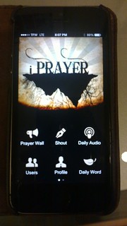
As you might have noticed in that post about the sidebar additions, we’ve featured a few mobile apps which are outliers in the mobile ministry space. Not so much because they are popular, but because they do things which are uniquely mobile, uniquely faith-first, and generally, meeting a niche need square on. iPrayer kneels squarely on those points.

This really isn’t a review of iPrayer as much as its an appreciation of what it does well. Much like the 1st version of Instagram, its a mobile-first social network. Once its installed, you don’t need an account to get into it, but it does help if you plan on posting prayers and interacting with the iPrayer community.
Much like MMM, there’s only one person behind the scenes at iPrayer, and that shows in the Daily Word feature. I like that idea, though in speaking with the developer, he mentioned that its possible that iPrayer could configured differently to allow for others’s to be profiled in the Daily Word.
I’ll say though that the thing which really opened my eyes to iPrayer was the UI (user interface). When I looked at the landing screen, my first thought was multi-lingual support. There were so few words and the icon design was so clear that I instantly thought about this being a mobile community app able to serve several languages at the same time. In that convo with the developer, there were no plans to go towards other languages. But, there are other language communities present. Seriously, neat.
My iPad now gets notifications from iPrayer when new devotionals are published. Like another app we’ve reviewed – Bible Bloom – its not about an intense study, but intentional contemplation about those things God desires from us. iPrayer was designed for those folks who have a need for prayer, but might not be as connected locally as some would wish. Its a neat app/service, and one we are proud to push forward as iPrayer is developed further.
For more information and to download: Apple iOS | Android.


