 Technically, it’s the last week of the year and I am supposed to be on vacation. It not felt needed to be taking this time off, but even felt that unction from the Lord that I really needed to set this aside and just breathe a bit.
And that’s been the case for the most part. Ok, so I cheated a bit one day and pre-wrote another post. But I’ve remained quiet on Twitter and in much administrative work. The break was needed. Then I was awaken from a nap on Christmas Day with a former idea about redoing the UI for the NET Bible. You see, I haven’t found a suitable application for the N8 which I own (I have indeed changed my perspective towards my needs for a Bible app on that style of a mobile several times), and have therefore left things stoic with the HTML files which come from the NET Bible’s publishing. It’s not difficult, as it is a bookmark in my web browser, making me just a browser search away from further readings. But, it’s not the most mobile-optimized experience. Hence, the waking from a really good 2nd nap.
Establishing the Goal, Identifying the Issues
The first issue that anyone runs into with mobile bible readers is getting around. Yes, there are other aspects such as speed, available content, notes, etc. But, I tend to always boil things down to two key features: reading and searching. Both of these aren’t done well enough in general on mobile, nor on specific platforms, to tilt me one way or another. I figured that since I’m in a browser often enough, and across two platforms which don’t have much shared between them in terms of consistently updated, shared applications, that I could do something that better fits my personal needs. One part of that is navigation, another part is that I search for content differently. The ideal reader for me would need to be equally proficient in both of these.
I am tacking the first issue of navigation on my mobile for this NET Bible. I want a UI that works on my mobile device, with one hand, that spatially orients me to the text, and doesn’t (necessarly) lock me into an app as much as it makes the case for a translation that works and I can change that source as needed. Reading the Word shouldn’t be a distraction, it should make me smile, even in the parts where the justice of God is splitting folks wide open. The UI is first.
Second is search. I’d like to be able to search anything and everything in the text. And then save that search. Search should work as fast as a contact search does. It also should be intelligent – showing me what I searched for previously, and automatically saving the search when its done. That’s the piece that would take the longest to nail. Maybe its a native solution only here – that’s ok, I’m willing to compromise from the route I’ve taken with doing the UI with HTML/CSS/JS – I think.

What’s Been Developed to Date
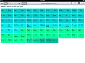
What you are looking at is essentially a framework, slightly HTML5-friendly and leveraging jQuery till my JS skills improve (uhmm, CodeYear is looking quite attractive). This is what I’m now using to get around the many, many pages that make up the NET Bible on my mobile. And the really neat thing is that it gets me around, while getting out of the way so that I can simply read. That is key for all of us when looking at reader applications and services, and I think this nails that well.
I’m skipping the landing page that’s done on the official NET Bible. Since this is a personal project, I’m really all about just getting into the text as fast as possible. As you can tell from the screenshot, each section has its own color. That’s just a visual aide to get me into that section as fast as possible. Interesting thing here was how the colors made it easier to navigate on the tablet, where it made little difference initally on the mobile.
At the top of the page is what amounts to a navigation menu. That’s just there to refine things and to setup an eventual search feature. I’ve ignored some (not all) of the conventions for touch-based navigation because I want to keep more of the screen available for text. Being able to have as much screen as possible for reading is important to me.
Remaining Issues/Imperfections
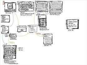
I’ve actually not yet gotten the text placed into this yet (at the time of this article’s writing/editing). I know what I want to have in terms of look and feel, but not sure how best to implement it from a JavaScript perspective. That’s a knowledge gap on my end that I hope to solve, but if you take a look at my sketches, its something that’s probably a lot easier than I’ve been thinking about it.
Another issue, and this follows the text, is that of having the notes show/hide in a pretty manner. The notes are one of the key reasons that I use the NET Bible (really, all published versions of the Bible should come with through translators’ notes). Having those notes show on a tap/swipe manner is something that I think I’d have to switch to using jQuery Mobile or jQuery Touch – or even a custom JavaScript function – to make work.
Performance is a problem. The Nokia N8 received a new web browser with the Nokia/Symbian Anna update, but it still seems to suffer a good bit with my using of jQuery. That’s going to bug me when the full text gets in there. That’s sitting as a near-major issue.
I have not (nor plan to) test this on every mobile platform. I built this on my iPad, and made sure it worked on my N8. It’s totally something to address a personal (peeve) need of mine, but I am compelled as all get out to share it. It uses jQuery, though should probably have the JS written from scratch into th page since it uses so little. And it relies on CSS being supported enough so that it works cleanly (though the HTML is semantically written so that it doesn’t matter if CSS is not supported at all). This also uses a bit of data for the image and for jQuery. So, if you wanted to use this as is, be sure you are aware of that part. I’m not sharing this to support it – only to share something that can be useful for your pursuits.

Things to Work On
At this point, I haven’t tweaked the NET Bible chapter pages as I would like to. The notes are my most important reason for using this text and figuring how to take their code for opening the notes into the footer area that I have is a bugger. I want that to work most of all, but haven’t yet figured up how to make it work best on my device (let alone anyone else’s).
Search needs to be worked on. I have the flow of how search works, now its a manner of building search that works best for (a) the device I’m using and (b) the approach I’ve taken. I’ll probably be leaning on the insights of some developer communities for this.
Why Even Do This
Personally, I’ve just not been happy with any Bible reader since Bible+. Part of that is that my attention and needs have changed even more than I’ve changed devices. I started simply wanting to read, then it became a matter of comparing versions, then needing something to facilitate teaching/discussions, then it was all about just having apps. Now, I just want the text. As much of it as I can take in, as much of it that’s historically receivable. As much as I can that will continue to provoke me to grow up in this. For all of that, I was practically compelled to build one at some point (Brett and LJ, I’ve listened).
On the other side of this, I’ve gotten a lot of questions about formats for documents on mobiles in 2011. I keep telling folks the same things: .txt and .html. Those are the most ubiquitous formats out there for text documents and work everywhere. If you can get your content into HTML 4.01 you really can meet just about every device made in the last decade that has a browser (regardless if they have a connection or not). If you have a “container” like this, and just fill in the text with whatever txt/html archive that you have available, it works. Many people don’t need multiple versions, they just need to get in and read.
I also thought about how the community came together to solve issues like this with the Palm Bible+ app from the Palm Pilot days. For those of you with a PalmOS PDA or Treo/Centro around still, you should dust it off and download that app and a few modules. Notice something different compared to current apps? Speed in the navigation and search. Heck, if you have peeked into the manual, you’d notice that there’s some easy to remember/use text shortcuts for just about every primary feature, and a few not-so-primary ones (I wrote the manual, and designed the website). Most of all, it gets out of the way. You get into the text and everything else gets out of the way. This is what I thought of when I had the NET Bible and other mobile bible apps. Yes, there is some extent of “designing the experience” that happens, but in consideration to the “Father in heaven who revealed this,” (Jesus said this to Peter) too little chance for that to happen. In a real sense of things, “get out of the way and let me meet God (in my mobile bible reading).”
I have ideas of how to do the search on my N8, but need to know if I need to hack the widgets/WRT feature and figure some kind of database that would live on my memory card which that search could address those queries (maybe there’s a search widget that could be constrained to the local files and/or an online search). Then I would have it, something similar enough to the simplicity of the PalmOS experience, but much like apps today where I am taking (some) advantage of the context of the device I am using and building from there.
From Here To…
This is something that I’m hoping to keep my attention towards finishing this year. Even if I don’t have the N8 at the end of the year, this is something that could work on just about any device I’d go with (except the iPhone). There’s a bit of pain happening with building this, and some understanding (again) of the fun folks (YouVersion, Logos, OliveTree, etc.) go through in building this. But, since I’m just looking to build something that works for me, I can keep most of the distractions at bay and just go for it. Plus, I’m using the HTML archive of the NET Bible as I’m building this, so if there’s something I’m not doing right, it can change pretty quickly.
For you, this is merely an exercise to share. Some of you might be in a similar mode that I’m in – nothing quite works and you have just enough technical skill to nearly get there. If you feel like taking a stab at this for your own efforts, here’s a link to my public Dropbox folder continaing the mobile container and the NET Bible archive (if someone puts this on GitHub, awesome). Whatever you do, let the folks at Bible.org know. I think this will help their efforts (and I’ve not even broken my brain on doing the UI completly from an icon-driven aspect, yet).
Mobile-Friendly and Personalization As Core to User Experience
The takeaway from this project is that there have been several methods to engaging Bible/document reading, social/offline networking, funddraising, and other initiatives in mobile ministry. However, even if you nail the features, at some point in the maturing of that person using the service or the company offering it, doing something that fits the mobile context and that’s personalized will come forth. It might not be the aims of your projects initially, but do know that eventually, they all point to these goals needing to be met.
Some people commit to reading the Bible anew at the beginning of the year. I’m trying to make a Bible app… yea, that fits.